
A pleasant Thursday to you all, dear readers! I’d like to open this week’s blog with a Classic Miles Anecdote.
As you may know, last week we published Trove’s list of the best movies of 2017, which I wrote after interviewing our staff. When I interviewed our newest intern, Chelsey, she picked “Wonder Woman” as one of her films. Naturally, I immediately mentioned two things; one, how great the movie was; and two, how I’ve appeared to have fallen irrevocably in love with the film’s star, Gal Gadot. However, in response to my admission of love, Chelsey chose not to openly laugh at me, as most do, but instead to provide a reason for my love, being the symmetry of Gal Gadot’s striking countenance. I hadn’t thought about it before, but it made perfect sense; if something is well composed, in this case Gal Gadot’s astonishing facial structure, it’s naturally more pleasing to the eye, and the same applies to film and video production.
Most people don’t even realize it, myself included on some occasions, but every shot of a film, show, or video production is meant to convey something, and to aid in the telling of whatever story it is you’re telling. Every shot is meticulously composed (in some cases less than others, cough Michael Bay cough) to send a message, and that effort is called … wait for it … composition. Like I said, many people who aren’t involved in videography or photography may not be familiar with it, but that’s what I’m here for! Without further ado, here are some of the basics of film composition!
As The Third Flies - The Rule of Thirds
Before we even breathe a word elaborating on composition, there is no more basic a component than the rule of thirds. It’s a simple concept; if you’re taking a picture or shooting a video, take the image and draw four lines, like a tic-tac-toe board (people, always go in the center if you’re going first, don’t get cocky). After that, place whatever you’re shooting on one of the intersections of those lines, called a “power point,” and boom, you’ve utilized the rule of thirds.

Now, after reading that, you may say “Well, thank you for making me aware, Miles. Having said that, way to waste my time by not telling me what it’s used for.” To which I would respond, fighting back tears, with an apology, and proceed to tell you why, like the Backstreet Boys always wanted. To be blunt, it’s just more interesting than putting something directly in the center of the screen. While this may contrast with my Gal Gadot symmetry argument, the rule of thirds still adheres to a strict visual formula enough that it’s still both pleasing to the eye and is able to attract your attention. Using the rule of thirds is a much more engaging experience when you’re shooting something.
Heads Up - Head Room in a Shot
Alright, so this one is ridiculously simple, it’s like the Simple Jack to this blog’s “Tropic Thunder” (“You m-m-make me happy”), but it is extremely important. It goes without saying, but if you’re shooting an actor, it’s safe to say that their head may feature prominently in what you’re shooting. We’re all familiar with heads, it’s where the face is, there’s typically hair on it (unless you commit hair suicide, like Prince William), and it’s where all the action is. Which is why it needs to be accommodated appropriately.
If you’re shooting someone, you can’t allow too much head room, as you may end up making the person look small or weak (although sometimes, that’s on purpose, i.e. “Mr. Robot,” but more on that later). But you don’t want to allow no head room or you’ll end up Aldo Raine-ing them and cutting off the top of their head, which obviously is not a good look for anybody. So unless you’re doing an extreme close-up or deliberately trying to make the person look like they have a lack of power, be sure to always give a moderate amount of head room.
The Weighting Game - Compositional Weight
This one sort of goes hand-in-hand with the rule of thirds, as it’s the next practical step in staging a scene after establishing your usage of the rule of thirds.

Let’s go ahead and take a look at an example, since even though I am a master wordsmith and wield the English language with the acuity of a classic composer, a picture is worth a thousand words (although, in my case, worth like 200 of my words). Take a look at the terrible cook from Pixar’s “Ratatouille” as he talks to his little rat bro’. You can see that his eye lines up with the upper right power point, while his rat bro’s eye is at the bottom left power point. This may not seem like anything too astonishing, but it brings a subliminal sense of balance to the scene that makes it very visually appealing.
Little Po Deep - Depth of Field
This is one that is so pivotal to composition but that is so obvious and so frequent that even Ben and I forgot about it when discussing the basic concepts of composition.
This may be a bit of a crude example, but what’s the more immersive experience, looking at a wall or looking at a hallway? If you said the wall, you’re either extremely easy to amuse or you have terrible vision.
If you’re shooting something, you want to make your production as immersive and involving an experience as possible, and if viewers can feel like they’re experiencing all three dimensions of that scene, it goes a long way to increase the quality of the experience of what they’re watching.
When talking about depth of field, we’re talking the ingeniously named foreground, middleground, and background. Check out the example below because, frankly, this is pretty simple stuff. It’s … beneath me (literally, bahahaha).

Jump in the Line, Rock Your Body in Time - Lines of Perspective
Sort of going hand-in-hand with depth of field, lines of perspective are a smooth and fancy way to draw viewers’ attention to something without having a massive red arrow pointing at it, or one of those awesome sandwich board guys dressed like a chicken doing some sick dance moves and sign tricks to get your attention (although, let’s admit it, those guys are dope). Essentially, lines of perspective are natural elements of a scene that are used to guide your eyes to something without the viewer even realizing it.
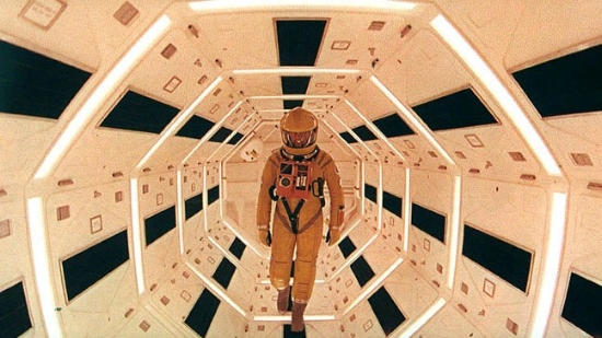
Take this scene from a film of average quality, "2001: A Space Odyssey." Sure, the lines are pretty pronounced in this one, but at the same time you're not even looking at them. Instead, you're looking at the man, which the lines are leading you to. Prettaaay sneaky stuff.
Fire at Will - Using, or Bending, the Basics to Tell Your Story
So if you’re a big bad, mack daddy, big cheese, hot shot videographer or photographer, and you’ve got all of these basics down, that’s when the fun starts; using them as a facet of your storytelling.
I’ve gone on record as a serious devotee to story above all else, but while a script is where a story begins, it’s going to end up being a part of a visual medium. Those visuals can end up being pivotal to helping your story get told, and showing something that your script doesn’t tell.
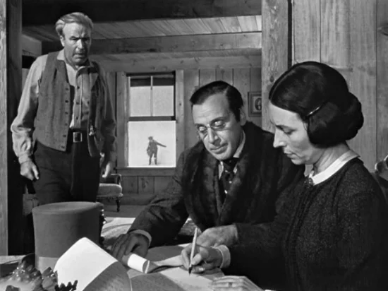
Take, for example, this famous shot from another legendarily mediocre film, “Citizen Kane.” In the scene, we see the parents of the titular citizen, who at this point is the little tyke playing in the snow in the background, speaking to a banker in the foreground (look at all of those keywords!). In this case, depth of field is used to show that Citizen Kid isn’t in control of the situation going on, as the adults dominating the shot shows.
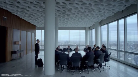
Or check out this scene from USA’s “Mr. Robot,” where the main character, Elliot, is dealing with a table of some seriously shady dudes. This shot perfectly uses rule of thirds, in this case with a column literally serving as one of the lines in it, clearly showing that Elliot and these men are on different sides, literally and figuratively.
Speaking of “Mr. Robot,” it is one of many shows and movies that are beginning to completely blow up these rules and utilize them in different, more ambitious ways. Another such show is “Luther,” a BBC psychological cop show starring Idris Elba, which totally abuses these rules to help enhance the narrative.
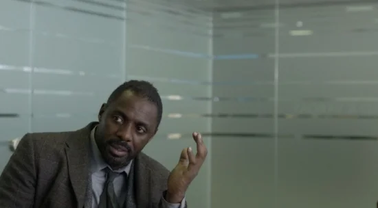
Take this shot of Luther himself, sitting at a desk, doing some strategizing. The amount of headroom and space around him is typically not recommended, given the fact that there is tons of dead space around him. But this is intentional, as it’s meant to show that Luther is doing some serious thinking, almost leaving space in the air for his thoughts to go.

Or this shot, that really stretches the line of perspective basic concept, but to great effect, as the viewer can’t help but be disoriented at what they’re seeing as their eyes are drawn to the assault, which is exactly what the show’s crew was hoping for.
But don’t just take my word for it; next time you’re watching a show, movie, or professional video, try to really notice the composition more than you would normally, and you’ll come to see that, in most cases, there are reasons behind every shot. It’s not a simple “Alright, Meryl, you just sit wherever and we’ll turn the camera on.” It’s a deliberate, strategic process, one that you appreciate without even realizing you are.
So that’s it for this week’s blog my people! If you enjoyed what you read go ahead and check out our entire series of masterpiec-- I mean blogs, on our glorious website. Thanks for reading!